I.Magazine Ad
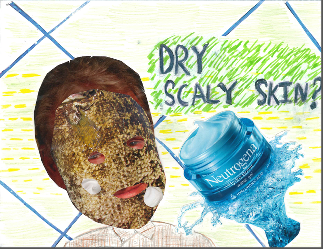
For this assignment ,our project was to create a magazine ad using cut outs from magazines/newspapers with an addition of markers, crayons , or colored pencils in order to enhance the elements of design .In the photo seen above ,you are looking at a magazine ad for "Neutrogena -Hydro Boost: water gel ".The ad displays a photo of Donald Trump being masked by fish scales with a few speckles of Neutrogena -Hydro Boost . The ads slogan is "Dry Scaly Skin ?'", this is marketing the idea that if you have dry scaly skin you may want to use Neutrogena Hydro gel .If you look closely at this photo you will notice the elements of design such as line (blue) , texture (fish scales ),shape (the shape of the lotion ),and balance (the background pattern and color ). I learned from this project the simple elements of design and how they can grab the attention of the viewer more easily if used properly .
II.Flyers
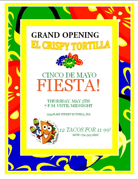
With the flyer seen above "El Crispy Tortilla" is a new Mexican Restaurant .The target market is people of all ages ,specifically the party goers .I am inviting people to a Cinco de Mayo Fiesta with an additional deal on tacos . The location of the restaurant is 1234 Main Street ,Bothell,MA . "El Crispy Tortilla " is opened 7pm to Midnight on Cinco de Mayo. People should choice to attend the Cinco de Mayo festival ,because its the Grand Opening of "El Crispy Tortilla " and there's a deal on tacos .
The elements of design displayed in this flyer are color , size , and shape . The color of this flyer is bright and bold , specifically around the border . The size of the pictures displayed in this flyer help the guide the viewer to the important parts , such as the taco guiding the viewer towards the deal on tacos . The shapes in this flyer also help balance the flyer out ,such as the sombreros . The principles of design viewed in this flyer are balance and pattern . The pattern around the border helped balance out the flyer .
The elements of design displayed in this flyer are color , size , and shape . The color of this flyer is bright and bold , specifically around the border . The size of the pictures displayed in this flyer help the guide the viewer to the important parts , such as the taco guiding the viewer towards the deal on tacos . The shapes in this flyer also help balance the flyer out ,such as the sombreros . The principles of design viewed in this flyer are balance and pattern . The pattern around the border helped balance out the flyer .
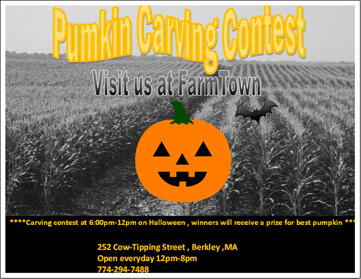
The flyer seen above is for "FarmTown ", a local farm that sells pumpkins annually . With this flyer I am trying to reach out to people of all ages ,specifically teens/young adults who feel to old to go trick or treating ,but still want to celebrate Halloween."FarmTown" is inviting people to a Halloween carving contest and winners will receive a prize . "FarmTown" is located at 252 Cow-Tipping Street, Berkley ,MA. "FarmTown" is open 12pm-8pm everyday , but the Pumpkin Carving Contest is at 6pm-12Am on Halloween . People should choice to go to the Pumkin carving Contest , because its a simple fun way to socialize and compete artistically ,while enjoying the fall .
The elements of design viewed in this flyer are texture , shape , and color . The texture is displayed in the background of this flyer (the corn field ). The shape of the pumkin is round and stands out . The pumkin stands out , not only for its extremely round shape , but its bold color . The principles of design used in this flyer were balance and contrast . The balance is seen with the different color fonts of orange and the different background color . The contrast is displayed within the cornfield seen in the background .
The elements of design viewed in this flyer are texture , shape , and color . The texture is displayed in the background of this flyer (the corn field ). The shape of the pumkin is round and stands out . The pumkin stands out , not only for its extremely round shape , but its bold color . The principles of design used in this flyer were balance and contrast . The balance is seen with the different color fonts of orange and the different background color . The contrast is displayed within the cornfield seen in the background .
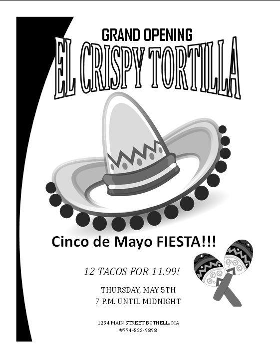
With the flyer seen above "El Crispy Tortilla" is a new Mexican Restaurant .The target market is people of all ages ,specifically the party goers .I am inviting people to a Cinco de Mayo Fiesta with an additional deal on tacos . The location of the restaurant is 1234 Main Street ,Bothell,MA . "El Crispy Tortilla " is opened 7pm to Midnight on Cinco de Mayo. People should choice to attend the Cinco de Mayo festival ,because its the Grand Opening of "El Crispy Tortilla " and there's a deal on tacos .
The elements of design viewed in this flyer are size and value . The size of the sombrero stands out to the viewer and in addition the value between the different shades of grey add value . the principles of design viewed in this flyer are proportion , contrast , and balance . The proportion of the sombrero to the maracas are accurate . The contrast of grey , black , and white help balance the photo .
The elements of design viewed in this flyer are size and value . The size of the sombrero stands out to the viewer and in addition the value between the different shades of grey add value . the principles of design viewed in this flyer are proportion , contrast , and balance . The proportion of the sombrero to the maracas are accurate . The contrast of grey , black , and white help balance the photo .
III.Tri-Fold Brochure

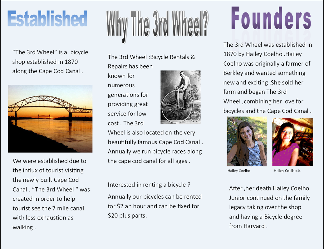
This is a photo of the "The 3rd Wheel" ,my Tri-Fold Brochure. "The 3rd Wheel " is a business that rents bicycles and repairs bicycles . The business started on the Cape Cod Canal and expanded its locations to Somerset and Fall river for people looking to get a nice view of the Taunton River ,Braga Bridge, Veteran Memorial Bridge ,and Portas de Cidade .Each shop opens Monday -Thursday 10am-8pm and Friday- Saturday 10am-9pm . We have specials such as the Fall Special , were each hour of renting a bike is half off . We are the best bicycle shop chain ,because we have been known for generations for our high quality service and low cost .
My design elements and principles are size , color , and balance . The size of the bike is large enough were it fits the page , but there's enough space to still provide important information. The light blue back ground color of the brochure helps balance out the brochure , so that its not just a white brochure , but it also doesn't mask the information provided on the page .
What I have learn from doing this project is how to edit a photo in adobe photoshop and how to balance out a brochure in which a way that the readers eye is guided .In photoshop I used filters , coloring tools , and the clone stamp in order to give my photos a cartoon look . I had also used back ground color and photos to keep the reader engaged and able to guide throughout the brochure . I've also learned how to link text boxes and take out hyphens in my work .
IV. Celebrity Birthday Card
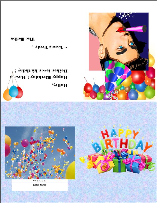
In the photo seen above this a Celebrity Birthday Card from Justin Beiber to me .The birthday card was printed on one side of a slice of paper , the paper then gets folder twice in order to be made into a card . The card is folded once horizontally and once vertically. The card displays a photo of Justin Beiber that has been edited in photoshop five times .The photo was edited with the poster edges filter , paint tool (lips), smudge tool (eye brows) , paint bucket (background), and darkened the shadow .
V. Thayer Street Brochure -Unique Service
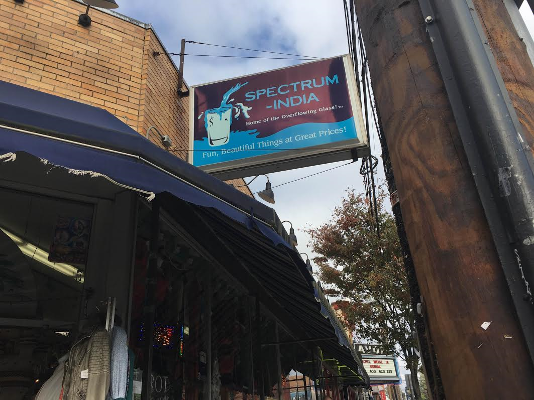
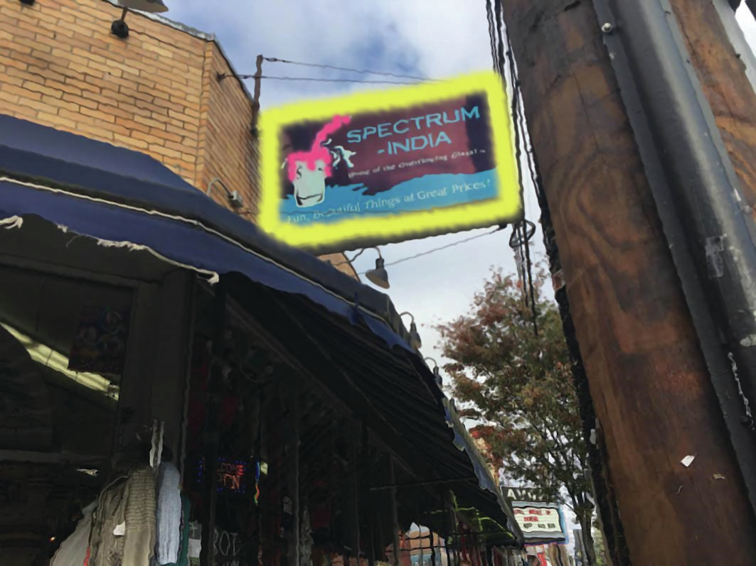
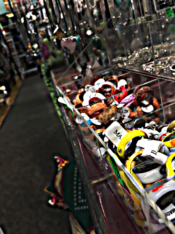
a. Spectrum India - Edit
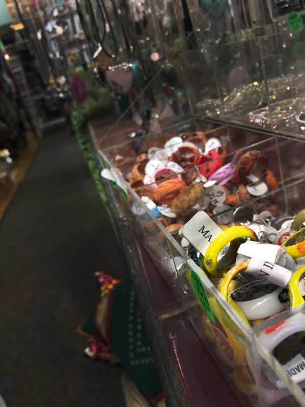
Spectrum India -Bracelets
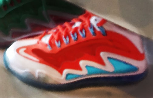
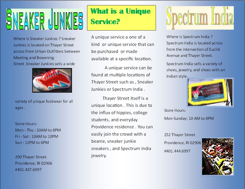
c. Sneaker Junkies -Edit
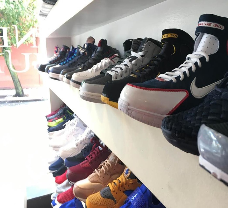
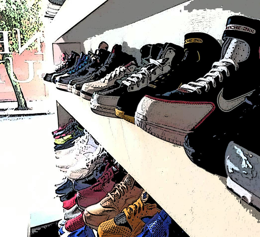
Sneaker Junkies -Sneaker Edit
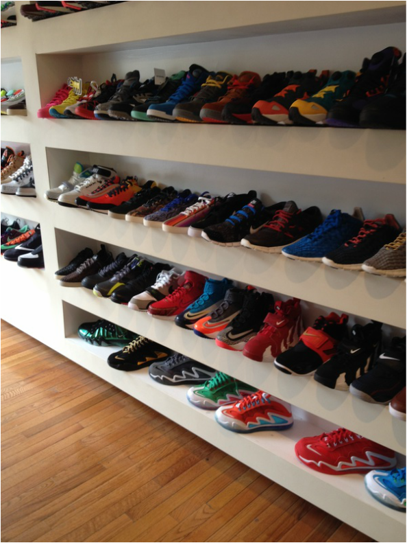
Thayer Street Brochure
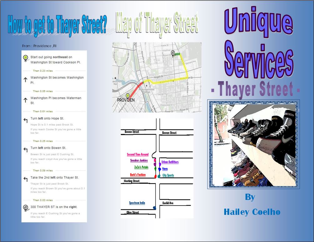
In the brochure seen above, I had edited unique service photos taken by my group that had attended this lovely field trip . I for one had not attended this field trip. The locations I used for my photos were Spectrum India and Speaker Junkies . I had used a wide variety of editing tools to create custom photos and word art edits. Some of the tools I used were the brush tool, dodge tool, burn tool, paint bucket tool, sponge tool, blur tool, crop tool and I used various filters in addition. What I had truly learned from this project was how to create unique text using a combination of word art and adobe photo editor. I had also learned how to make photos stand out in brochures by using colorful frames.
